French Paper Unveils 'Total Package' Design
![]() Print this Article | Send to Colleague
Print this Article | Send to Colleague
Intricacy of detail can now take many forms in print design as this past week's edition of PaperSpec's (Palo Alto, Cali., USA) Cool Designs blog demonstrated. On May 18, the paper design news blog recognized French Paper Co. (Niles, Mich.) for its French Paper Total Package promo pieces. In the promo, recipients will find Kevin Cantrell’s deck of cards stacked in favor of exquisite design, and spend some time quietly contemplating book replica packaging designs as exquisite as any of the artworks they may contain.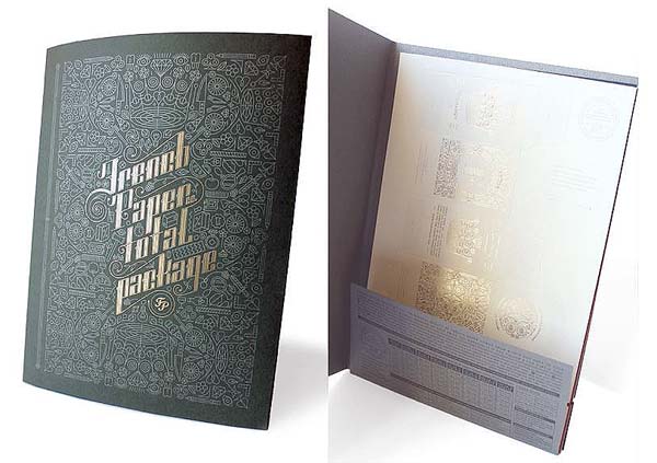

Never one to do things by half, French Paper recently unveiled these gorgeously detailed demonstrations of how the various weights and colors of its many offerings can be transformed into stunning packaging. Printed, foiled, and embossed by Franklin Press and Macintosh Embossing, these promos are bound to linger on designers’ desks long after others have been filed and forgotten.
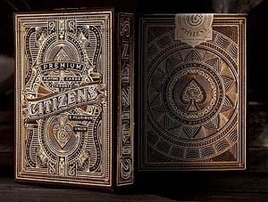 For what the recent renaissance in premium playing card design has wrought, one thing it has encouraged is some of Cool Designs' favorite graphic designers to try their hand at this delightfully portable medium. The blog noted that print-making phenom Kevin Cantrell has crafted a deck "like no other." Gold foil, hot stamping and bronze foil – if your entrance into paradise is decided by the luck of the draw, we imagine this is the caliber of deck that will be used.
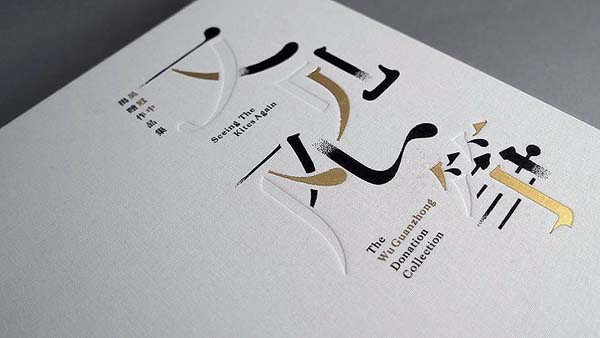
‘Seeing the Kites Again’ Book Design (pictured below)
Taking its lead from the work of Wu Guanzhong whose art is as much about the negative spaces as those marked by ink, this 300-page book celebrates the beauty of the ethereal and the not-all-there. The characters on the cover, for instance, are made up of blind embosses and debosses, as well as black lines that end in sudden fades of ink. Faded characters can also be found on vellum-like translucent pages, which also partially obscure photos of the artist himself.
More examples of artistic designs, labels, and packaging that incorporates paper products can be found on PaperSpec's design news archive available online.


