WEBSITES
So you’ve spent the past two years redesigning and programming your health system website based on a redevelopment plan focused on achieving organizational strategic and marketing objectives. You’ve given it a look and feel that’s consistent with new branding standards that have also been applied to the web sites your community hospitals used to maintain on their own. You’ve developed thousands of pages of new content, improved search engine optimization and created a far better user experience. And then you formally relaunched the site.
 Time to sit back and bask in your glory?
Hardly, says Stephen Strong, digital director at Northwestern Medicine in Chicago. Strong, who joined Northwestern just three weeks after the updated NM.org went live in 2017, recalls his first month on the job. “We were flooded with feedback,” he said. “I had no idea how much feedback we’d receive.” Turns out that “everyone has an opinion, whether they are an administrator or physician.” It shouldn’t have been surprising, he said. “There was no way to circulate 8,000 web pages for leadership approval.” In the first month, they received more than 100 comments from physicians alone.
Fortunately, the team was ready. It had created several paths for feedback: a public option on the website; an employee option on the internal intranet; and a dedicated email. Every comment fed into an online workflow management system called Feedback Insights, where it was filtered by category and subcategory, then synced with the department’s project management system.
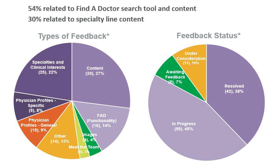
“This was very helpful to control the sense of panic,” he said. “When leadership said, ‘Everyone’s commenting on the web site, what are you doing?’ we could show them the data.” In the first month, for instance, team members were able to demonstrate that 90 percent of the 111 discrete issues received were resolved or engaged in a solution, and 90 percent of all physician feedback had been acknowledged. They showed that half of the feedback received was related to the “Find a Doctor” section, while 25 percent concerned content-related requests (see Figure 1).
Figure 1. First-Month Progress
Set Priorities; Show Progress
All feedback was considered in light of the redevelopment plan and best practices for website design before any changes were made.
First, they set priorities and created the following tracking categories:
- Resolved.
- In progress.
- Waiting on more input.
- Requires a business decision.
- Under consideration.
The last category was for those things that might or might not change. As an example, Strong said, “We’re not going to move Find a Doctor because one person complained.” They also created consumer personas that helped guide decisions for physician search and results and for structuring content in the service line sections.
Then they routed issues to one of three teams: digital addressed the technical issues; marketing served as the voice of the consumer and ensured that the site aligned with broader marketing strategies; and senior leadership weighed in on business and clinical decisions. For instance, there was debate about whether to list independent physicians in the Find a Doctor section. “That’s not a digital or a marketing decision,” Strong said, “that’s a business decision. Those determinations were made by a four-person governance committee of senior leadership.
Then Strong and his team went on what he calls a “listening roadshow,” meeting with 50 departmental leads to collect feedback and set priorities for implementing appropriate changes, such as expanding the text search in Find A Doctor to include clinical interests; highlighting employed doctors in search results; and adding “Meet the Team” in the service-line sections and on subspecialty pages.
”We took the results back to senior leadership to show they were making progress in addressing concerns and ensuring internal stakeholders felt heard,” he said.
Next Steps
Now Strong is looking ahead to year two and leveraging analytics and user testing for impactful enhancements, including:
- Maintaining the existing site. With over 8,000 pages, NM.org receives daily requests for content update from clinical and administrative departments.
- Improving the site’s usability. This includes streamlining the Find A Doctor search process, improving content navigation through service line pages and revising the Find A Location page layouts
- Expanding the content. This includes adding a wellness blog section for social media content, integrating quality data reports for all hospitals and adding a Meet the Team section to all service line sections and subspecialty pages.
- Evolving the site based on what’s happening in the industry, such as adding a chat function in the billing section.
This article features an interview with:
Stephen Strong
Digital Director Marketing
Northwestern Memorial HealthCare
Chicago, Illinois


